Sут
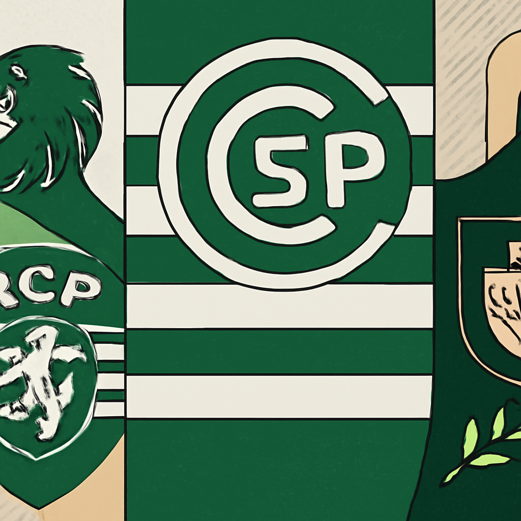
After 25 years without a rebrand, Sporting Clube de Portugal (SCP) undertook a significant revamp of its identity, led by the creative agency JKR. The rebranding focuses on returning to the club’s roots while integrating modern design elements, aligning with the values of its 180,000 members who see the club as more than just a sports team.
Как это работало
The process began with extensive research and interviews, gathering insights from members about their attachment to the brand. The most notable request was to bring back the 1945 crest, featuring a lion mascot, which resonated more with the members compared to the previous design. JKR analyzed various iterations of the lion and selected the best elements to create a modern version while maintaining its classic charm. They also developed a new typeface, "Sporting Sans," inspired by the original crest's typography, ensuring it felt contemporary yet rooted in history.
Результат
The rebranding resulted in a visually striking identity that integrates the 1945 crest, new typeface, and a unique pattern derived from the original stadium entrance. This transformation is not just aesthetic; it aims to foster a deeper connection between the club and its community. The first reactions to the rebrand have been overwhelmingly positive, with members feeling a renewed sense of pride. The application of the branding across merchandise and digital platforms reflects a high-design approach, akin to luxury fashion, which could enhance merchandise sales and member engagement.
Why It Matters для тебя
This case underscores the importance of leveraging community insights in branding. By engaging with members and understanding their values, brands can create identities that resonate deeply and facilitate stronger connections. If you’re considering a rebrand or brand refresh, prioritize community feedback and heritage elements—these can differentiate your brand in a crowded market and bolster loyalty among your audience.