The Gist
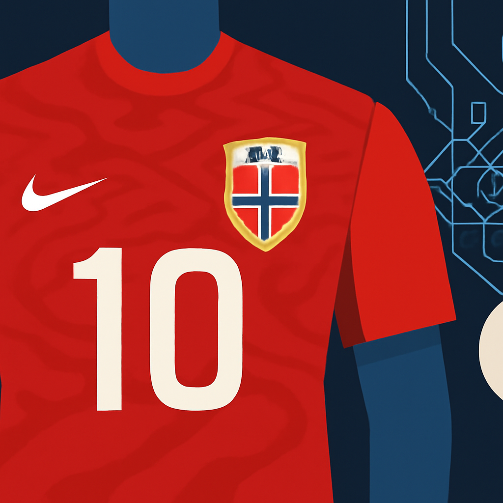
Norway's national soccer team faced challenges when introducing a font inspired by the runic alphabet for their World Cup jerseys. Initially too difficult to read, the design required a complete overhaul to meet FIFA's readability standards while still honoring Norwegian heritage.
How It Worked
In collaboration with Nike, the Norwegian Football Federation developed a new typeface called Taakeferd, meaning "journey through the fog." The design process involved extensive research into the runic alphabet's angular strokes, ensuring that the final product maintained the runic essence while adhering to modern readability requirements. The design team created numerous iterations to achieve a balance between sharp, distinctive shapes and legibility in broadcast formats.
Results
The newly designed Taakeferd font is not only compliant with FIFA's rules but also resonates with Norway's identity as they returned to the World Cup after 28 years. The jersey's unique typography has been well-received, contributing to the team's visual branding as they progressed to the quarterfinals against England.
Why It Matters for You
This case highlights the importance of balancing brand heritage with practical requirements in design. For any business or project, understanding your audience's needs while staying true to your roots can create a more impactful and memorable identity. Consider revisiting your branding strategies to ensure they resonate with both your heritage and your audience's expectations.